INK+WIT BRAND DESIGN: Elizabeth Lawson Design


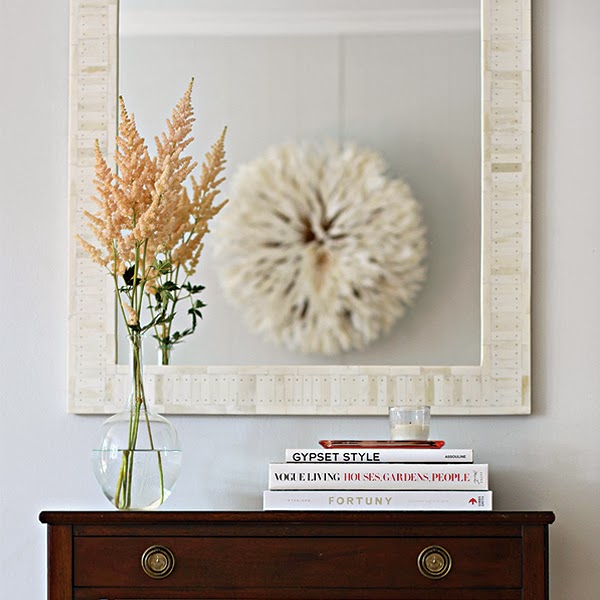
I had the pleasure to work with the lovely and very talented interior design, Elizabeth Lawson, located in Baltimore, MD. Elizabeth has a soft Boho chic style that would rock anyone's space. I love her use of texture and and color palette.
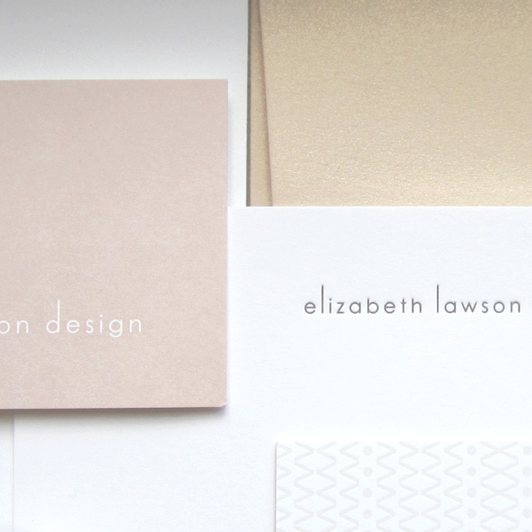
For Elizabeth's brand ID (or logo) we stayed very simple but ultra elegant with three ligatures elongated for a very sleek and slightly geometric look. The font is class Century Gothic. The stationery suite followed the classic sleek look of the ID in the colors nude blush, charcoal gray, taupe gray and white. I love the Boho pattern created for the backside of the business card letterpress printed by the amazing and dear Spark Letterpess. The neutral soft colors are warming and welcoming but pop with the charcoal gray. Just enough contrast and we love the blush metallic envelope with letterpress texture.
Please visit Elizabeth's site and wonderful blog which INK+WIT designed here!


